So after getting with the program and installing a blank WordPress theme I finally have a fully-functioning backend, so hopefully the rest of the process will be a little bit faster than what we’ve seen so far.
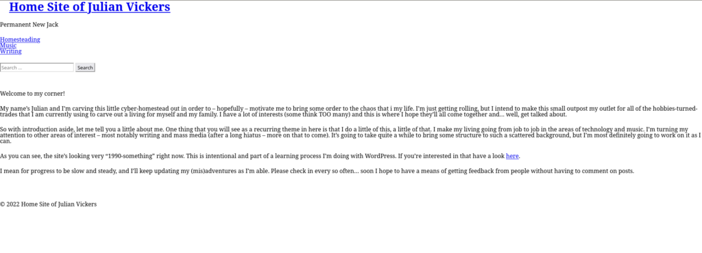
It’s nice having all of the basic functions of the media and page/post actions available again, but starting from square one with style is another story altogether. Here’s what happened to my page when the theme was first installed:

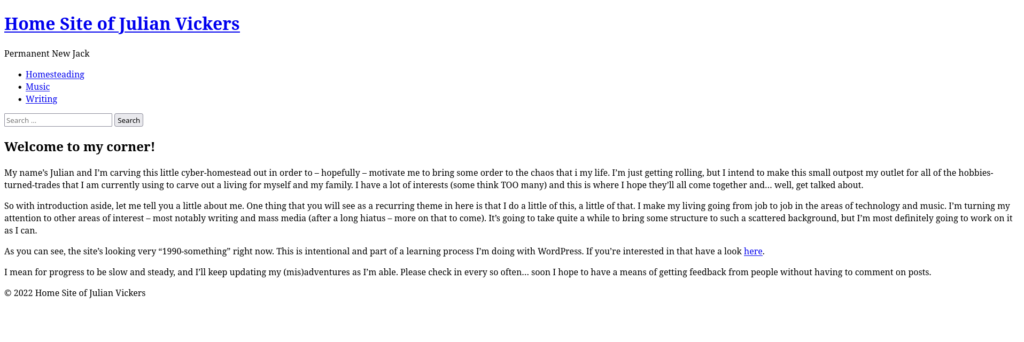
Notice the complete lack of… anything. Title, menu, and text all the same size, no spacing between any elements whatsoever, and that classic link color that we’d have called ‘fugly’ back in the day. This is the result of having nothing but boilerplate code in the style.css file. I find it interesting that 26 lines of css code can be used to make a site appear UGLIER than if there’s no style at all… after all, this is what you get when you eliminate the stylesheet completely and let the browser guess at what you want:

All right, so that’s not going to win any design awards but I think we can all agree that it’s miles above the first pic!
So is the takeaway of all this that – with a little time and effort – I’m able to conjure up a stylesheet that creates a site way less attractive that if I’d never started at all? Of course not! It’s a learning exercise, Patrick! So I started a’learnin’.
First order of business is to get some separation between elements to facilitate some semblance of readability. I’m moving big rocks right now and so I’m clumping together multiple elements using the following:
.menu-main-menu-container,p,#site-description,#menu,#header,.entry-title,.entry-content,.entry-links {
	padding-bottom: 25px;
}
That will at least give us some vertical separation and allow things like separate paragraphs, header, menus and the like. Readbility improved but a long way to go!
I couldn’t leave and start work for the morning, though, without at least addressing the fact that my site title was EXACTLY the same line height as all the rest of my text. If my site title doesn’t deserve a little extra pop, then what does? So I put the following into my stylesheet:
#site-title {
	font-size:2em;
	font-weight:bolder;
	padding-bottom: 25px;
}
And NOW we have a little bit – a VERY little bit – of variety happening:

There’s a lot more work to do yet, and with only a few minutes a day to get to it it’s slow slogging… but the next order of business is to start breaking out heading styles, fonts choices, and the like.
More on that as soon as I can!